
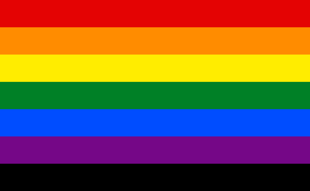
In my previous post, I talked about the early history of the Pride Flag, designed in 1977 by Gilbert Baker. The version of the flag that is most known today, the 6-strip flag that Baker called the ‘Commercial Version’, was embraced by the San Francisco LGBT community about two years later, after the assassination of Harvey Milk, who had encouraged Baker to develop the flag.
The Commercial Version succeeded at capturing the hearts of the LGBT community, who adopted it as the symbol of their movement and community, the way Milk had hoped would happen. By the end of the 80s, the Commercial Version was firmly ensconced in LGBT culture and by the middle-90s had become almost ubiquitous as a symbol with gays and lesbians. Those who felt safe being out often flew it on their houses, had bumper stickers of it on their cars, and so on. By the end of the decade, rainbow-colored merchandise was marketed at gays and lesbians in every imaginable way (and a few you might not want to imagine).
In the 1980s, as the AIDS Crisis developed, some people began to put a black stripe on bottom of the Commercial Version (below the purple stripe) to represent those who had died of AIDS and the struggle to defeat AIDS. This version was sometimes called the Victory Over AIDS flag. However, as a symbol of the AIDS Crisis it never really caught on. As I was working on this post I repeatedly searched for images of it and couldn’t find a photo of it, just this graphic. Perhaps it failed to catch on because it wasn’t visually distinct enough from the Commercial Version, or perhaps people read it as suggesting that all gay people had AIDS.
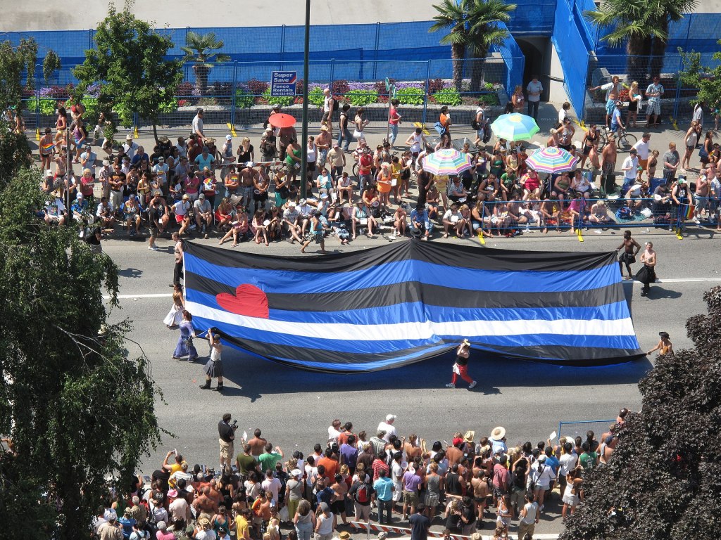
In 1989, in the lead-up to the 20th anniversary of the Stonewall Riots, Tony DeBlase decided to develop a flag to represent the Leather Community. DeBlase was a Chicago-area kinkster who was the publisher of two important BDSM magazines, the extremely influential Drummer and the slightly-less well-known DungeonMaster. Leathermen and women had been participating in Pride parades ever since the start of the Pride Parade movement (in fact, Brenda Howard, sometimes called ‘the Mother of Pride’ because she was such a prominent gay rights activist in the 70s and 80s, was a bisexual leatherwoman), and DeBlase felt that the time had come for the leather community to have its own flag to show it off its identity in parades and similar events. So at International Mr. Leather in May of ’89, he presented the leather community with what has become known as the Leather Pride flag, or sometimes the BDSM Pride flag. Inspired by the Gay Pride flag, DeBlase intended the flag as a rough draft and expected to get feedback on a final version of it. But the community adopted it without much debate, and less than a month later, the flag appeared at a Pride Parade in Portland, OR. Whereas Baker had assigned the stripes of the Pride flag symbolic meanings, DeBlase resisted such a move, saying that viewers were free to interpret the colors as they saw fit.
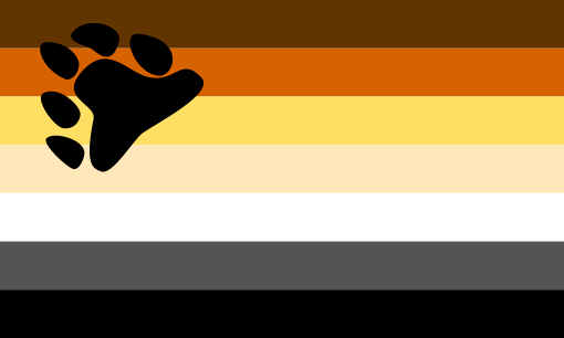
Perhaps inspired by the Leather Pride flag, in 1994, Craig Byrnes created a series of prototype flags to represent the gay Bear community, which celebrates men who are heavier or hairier than the supposedly ideal gay man. He created physical versions of 4 proposed flags and offered them for viewing at a Bear event in 1995. The most popular entry, inspired by Paul Witzkoske, is modeled on the Leather Pride flag, with a series of stripes in shades of brown, orange, white, and black, with a black paw print in the upper left-hand corner. The color scheme is intended to represent different species of actual bears, thereby symbolizing the racial inclusivity of the Bear community.
When the Gay Pride flag premiered, the word ‘gay’ had not quite acquired the meaning it has today. Used today, the word most commonly refers to gay men in specific (as in the phrase ‘gays and lesbians’). But in the 70s, the word gay had a meaning closer to ‘non-heterosexual’, so that the ‘Gay Pride movement’ was not intended to represent only gay men, but also lesbians, bisexuals, and transgender people as well. Thus the flag was, in Baker’s understanding, a symbol intended to include all queer people. However, over the 80s, the various groups in the LGBT community began to develop a clearer vocabulary to distinguish themselves and their particular group’s unique needs and challenges, hence the development of terms like ‘LGBT’ and the now-obsolete ‘lesbigay’, with ‘gay’ referring more to men. The word’s use as an umbrella term, however, still continues in terms like ‘gay marriage’ and ‘gay rights’ in politics.
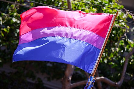
Because of this evolution in language, at the end of the 90s, different groups began to want a flag that represented their specific sub-community, perhaps reflecting a sense that the Gay Pride flag was somehow primarily representative of gay men rather than the whole community. In 1998, bisexual activist Michael Page premiered a Bisexual Pride flag, with magenta, lavender, and royal blue stripes. This flag was intended to combat the problem of bi-erasure by raising the visibility of the bi community.
The next year, graphic designer Sean Campbell published a proposed Lesbian Pride flag. It featured a black triangle on a purple background, representing the black triangle that Nazis used to identify lesbians (parallel to the more familiar pink triangle for gay men). Over the triangle was a white labrys (double-headed axe), which had been an occasional symbol for lesbians since the 1970s.
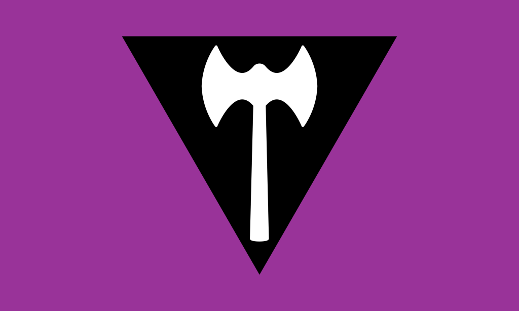
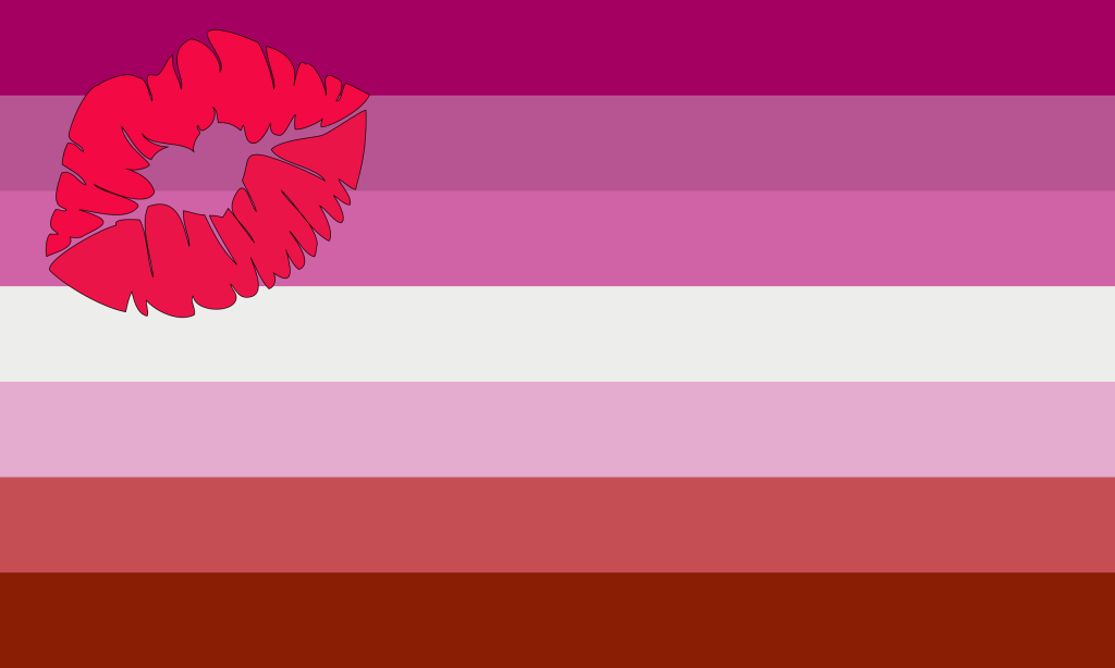
Campbell’s flag never won widespread acceptance, perhaps because it differed so sharply from the now-traditional Pride flag or perhaps because it drew off symbolism that wasn’t well-known. In 2010, Natalie McCray proposed the Lipstick Lesbian Pride flag on her blog. This flag has 6 stripes of different colors of pink and red with a white bar in the middle and a red lipstick trace in the upper left corner. But McCray’s proposal proved controversial, since it was intended to excluded more butch lesbians and because McCray had made bi- and transphobic comments on her blog. A version of McCray’s flag with the lipstick trace removed proved somewhat more popular, but other flags have since been proposed, including two that used orange and pink stripes, but none of these has won general acceptance.
About the same time that Campbell proposed the first Lesbian Pride flag, trans woman activist Monica Helms designed the now-familiar Trans Pride flag, with blue, pink, and white stripes. The first known use of the flag was in a Pride parade in Arizona in 2000, and by the early 2010s it was gaining widespread use and recognition.
Since the 2010s, more and more ‘identity pride’ flags have been proposed. In 2010, a pink, yellow, and blue Pansexual Pride flag was created by Jasper V to help increase the prominence of the Pansexual community. In 2011, Marilyn Roxie created a Genderqueer Pride flag with lavender, white, and green stripes. In 2014 Kye Rowan promoted a Non-Binary Pride flag with yellow, white, purple, and black stripes for those who didn’t feel adequately represented by the Genderqueer flag. In 2013, an Intersex Pride flag was created with a purple circle on a yellow background. In 2014 the Aromantic Pride flag was developed with green, white, grey, and black stripes.
And there are many, many more, including flags to represent demisexuals, greysexuals, polysexuals, polyamorous people, demiboys, demigirls, and a good number of other groups. With full respect to all these different groups, I just decided that it was too difficult to show them all, but this Wikipedia page offers a good place to find them.
In 2017, the city of Philadelphia paid a marketing firm to design a flag intended to highlight the issues that people of color face within the LGBT community, such as sharp discrepancies in access to health care and HIV rates. The marketing firm produced what has sometimes been called the Philadelphia Pride flag, which adds a black and brown stripe to the top of the Commercial Version.

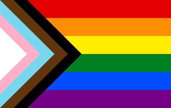
A year later, non-binary graphic designer Daniel Quasar took elements of the Philadelphia Pride flag and the Trans Pride flag to create the Pride Progress flag. This flag adds a right-pointing chevron to the Commercial Version using the Trans Pride flag’s stripes, with additional stripes of black and brown to represent people of color. This flag has become quite popular very quickly; when I attended Toronto Pride last week, I noticed that the Pride Progress flag had almost completely displaced the Commercial Version, both as a decoration for buildings and in the Pride Parade. Since 2021 there is a variant of it that adds the Intersex Pride flag to the chevron (creating something that looks rather like an LGBT Vorlon…)
I confess to having somewhat mixed feelings about the proliferation of these ‘identity pride’ flags. I think it’s very important that people have symbols they find meaningful that express their identity and needs. The Commercial Version played an enormously important role in helping the LGBT community recognize its own existence and present itself to the world. So on the one hand, it’s great that these flags exist for these sub-communities to rally around and proclaim their existence clearly.
But on the other hand, the explosion of flags for increasingly smaller and more nuanced identities at some point becomes self-defeating because I’m pretty sure that I couldn’t distinguish the Aromantic Pride flag from the Demiromantic Pride flag, which means the flags aren’t working (at least on me) to communicate their distinct identities, at which point they just become one more flag. So there’s a disjuncture between the flag as a personal totem for those it represents and the flag as a symbol that communicates a particular identity to the wider world; these flags work well for members of the group, but much less well for those not in the group.
The simplicity of the Commercial Version worked very well to serve as a symbol that is today nearly universal (at least in Western culture), and Baker very smartly took something that was easy recognize (a rainbow) and give it a new meaning (Gay Pride), whereas these more recent flags have to create entirely new images (whatever combination of stripes and colors and other details they employ) and use them to communicate a new and very nuanced meaning (the particular atomized identity they represent). The Bear Pride flag does a good job because the paw print encourages the viewer to read the stripes as representing bears, and the Leather Pride flag puns off of the idea of masochists being ‘black and blue’. The Trans Pride flag riffs off the common American association of pink and blue with girls and boys. But there is no particular cultural connection between yellow and intersex people, for example, and unless one already knows how a greysexual is distinct from a demisexual, I’m not sure the Greysexual Pride flag effectively conveys its group’s identity.
So the problem, as I see it, isn’t that these groups don’t deserve flags to represent themselves; it’s that I don’t think many of these flags are particularly good examples of flag design. (And I come from Milwaukee, a city infamous for its terribly-designed flag.) They tend to over-rely on the idea of horizontal stripes, mostly because at this point, an identity pride flag is expected to have them. The stripes of the traditional Pride flag have become a straight-jacket for those trying to find a flag design, trapping their subjects into flags that don’t work effectively to highlight their communities. The Intersex Pride flag does have the virtue of bucking the colored stripes model and offering a simple and memorable design.
And I think the Pride Progress flag, unfortunately, is particularly poorly-designed. One of the basic principles of effective flag design is to not use more than three colors, but the Pride Progress flag uses a staggering 11. Baker’s Commercial Version breaks that rule, but it draws off such a well-known symbol that it isn’t confusing or muddy, yet I’m not sure that the same is true for the Pride Progress flag. I also think that the black and brown stripes don’t play well with the colors next to them, but I suppose that’s more of a personal aesthetic judgment.
Another general rule of flag design is that it should be easy to draw the flag from memory, something a child could draw with crayons. The structure of the Commercial Version is pretty easy to recreate. The rainbow element is easy to recreate because we all learn the ROY G BIV order of a rainbow, but the colors of the chevron are harder to remember–is the brown stripe to the left or the right of the black? Is the pink or the blue stripe next to the white?
And again, I want to emphasize, this is a criticism of the flag’s design, not the concept behind the the flag, which I fully support.
Some older LGBTs are uncomfortable with the Pride Progress flag because it has occasionally been presented as a “replacement” of the Commercial Version, implying that it is somehow superior to the Commercial Version. I think framing it that way is a mistake because it unnecessarily puts the two flags in conflict. This isn’t an either/or situation. We can have both. It’s a mistake to say that we should put away all our Commercial Versions because this is a symbol that means a lot to several generations of queer people. But we can have more symbols than just one.
Older gays and lesbians sometimes point out that the idea of the black and brown stripes are redundant; People of color, they argue, don’t need particular stripes to represent them, because the Commercial Version has always been meant to represent all LGBT people. That’s certainly true, but it also sort of misses the point.
For much of the past forty years, the goals of the Gay Pride movement have tended to be things that benefit the white middle class more than the lower class or people of color: protections against job and housing discrimination, gay marriage, the right to serve in the military, the fight against HIV, and so on. While those things certainly do protect queers of color, many other issues that particularly affect LGBTs of color have tended to lag behind, such as the violence against black and brown trans women. Health insurance covers AIDS medication (indeed, Obamacare requires insurance companies to cover PrEP for free), but that doesn’t help lower class LGBTs who don’t always have good access to insurance because we link it to employment. The Pride Progress flag is intended to call attention to these sorts of disparities, and to remind the white middle class queers that there are other segments of the LGBT community that need support and to have their concerns addressed. And the fact that this flag has become so widespread so quickly demonstrates that it means something important to a lot of people. I just wish it worked better as a flag.

wow!! 75Role Playing vs Role Playing
LikeLike